Read the full article: Theory of painting realistic leather on miniatures.

Showing posts with label Tips'n'Tricks. Show all posts
Showing posts with label Tips'n'Tricks. Show all posts
3 Sept 2012
Textures - leather
This tutorial has been relocated to my main site, Minichix Studio.
Read the full article: Theory of painting realistic leather on miniatures.
Read the full article: Theory of painting realistic leather on miniatures.
12 Aug 2012
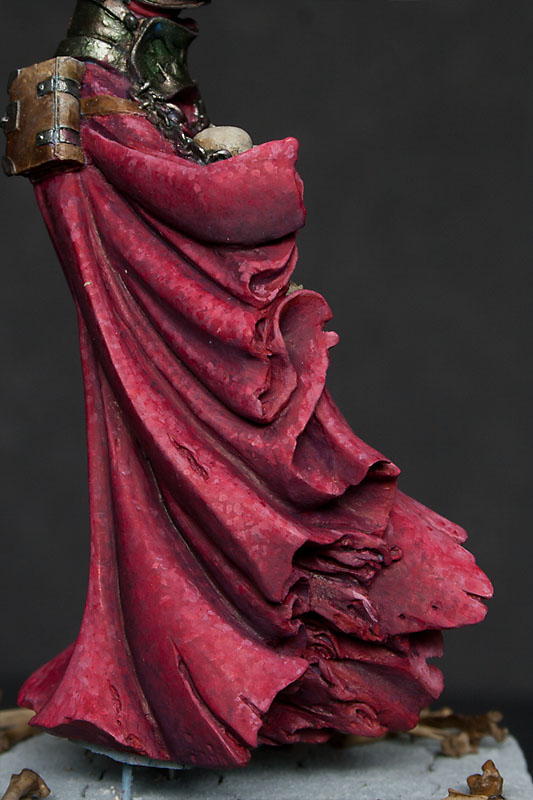
Textures - crushed velvet
This time I'll try to explain how I did the velvet robe on Menhom Dark Shadow.

I started the robe as plain red. As you can see I even added some initial lights and shadows. But then I realised that this robe is big enough (I'd even say huge) to add some freehand, or maybe texture.
Because initially I was going for old and dusty look, the embroidery, I was going to mimic with freehand, would have to be fairly damaged. I wasn't sure if I'll be able to do that, so I decided to go with crumpled velvet look.
To do that I decided to try 'doting' technique presented by Alexi_Z in her video tutorial. That was my first try, so the results are far from ideal, but I'm quite happy anyway. I learnt a lot doing that piece, and the next attempt should be more successful.
On the first two pictures you can see the initial shading on the robe. It's not perfectly smooth or too contrasty, but it's OK. I'm gonna cover it with lots of dots.


When I made my mind how exactly I I'm gonna paint the robe, I did a little try on one of the creases to find out If I'm capable of pulling that off.

It looked quite nice, so I started to build shadows.
On the pictures below you can see how I was trying to control depth of the shadows not only by used colour, but also by placing more or less dark dots in the recesses.


Then I started to add dots with brighter colours to create lights. Like with painting smooth surface I was building lights gradually, by change of colour and placement of the dots.


Later it was mostly going back and forth with various shades to build a nice gradient. I used quite a lot of base colour to make shadows and lights less uniform. To soften the transitions a bit and made it look more like a fabric, not just collection of dots, I used some red glazes.


And here, finished robe, with some final highlights on the edges.


And at the end, colours I used to paint the robe, maybe someone will find it helpful. I know that I'm using some really old and discontinued GW colours, but you can easily find something similar in other ranges.
Base:
Red Gore (GW)
Highlights:
1st light Andrea Flesh Paint Set
Offwhite (70820 VMC)
Shadows:
Liche Purple (GW)
Storm Blue (GW)
Black (70950 VMC)
Washes (GW):
Baal red
Devlan mud
Leviathan purple
Thraka green
cheers
'eM

I started the robe as plain red. As you can see I even added some initial lights and shadows. But then I realised that this robe is big enough (I'd even say huge) to add some freehand, or maybe texture.
Because initially I was going for old and dusty look, the embroidery, I was going to mimic with freehand, would have to be fairly damaged. I wasn't sure if I'll be able to do that, so I decided to go with crumpled velvet look.
To do that I decided to try 'doting' technique presented by Alexi_Z in her video tutorial. That was my first try, so the results are far from ideal, but I'm quite happy anyway. I learnt a lot doing that piece, and the next attempt should be more successful.
On the first two pictures you can see the initial shading on the robe. It's not perfectly smooth or too contrasty, but it's OK. I'm gonna cover it with lots of dots.


When I made my mind how exactly I I'm gonna paint the robe, I did a little try on one of the creases to find out If I'm capable of pulling that off.

It looked quite nice, so I started to build shadows.
On the pictures below you can see how I was trying to control depth of the shadows not only by used colour, but also by placing more or less dark dots in the recesses.


Then I started to add dots with brighter colours to create lights. Like with painting smooth surface I was building lights gradually, by change of colour and placement of the dots.

Later it was mostly going back and forth with various shades to build a nice gradient. I used quite a lot of base colour to make shadows and lights less uniform. To soften the transitions a bit and made it look more like a fabric, not just collection of dots, I used some red glazes.


On the pictures below you can see the difference glazes did. Colour is more vibrant, and whole robe looks more consistent.


And here, finished robe, with some final highlights on the edges.


And at the end, colours I used to paint the robe, maybe someone will find it helpful. I know that I'm using some really old and discontinued GW colours, but you can easily find something similar in other ranges.
Base:
Red Gore (GW)
Highlights:
1st light Andrea Flesh Paint Set
Offwhite (70820 VMC)
Shadows:
Liche Purple (GW)
Storm Blue (GW)
Black (70950 VMC)
Washes (GW):
Baal red
Devlan mud
Leviathan purple
Thraka green
cheers
'eM
24 Mar 2012
A dress with a serious case of 'chicken pox' - WIP
Yesterday I was thinking what can I do, to make this huge surfaces of red dress more interesting. After a while (old and rugged golden embroidery even if very spectacular, is a bit too complicated for me atm) I decided to go for worn and old look of the fabric in 'Natalya style'. Well, tbh she's not using this technique to get worn look, but I hope I can adapt it for my purposes.
So dots, dots... lots of them....
And after one evening, the effect is hmmm... interesting at least, but not even close to the original;p

For now the dress looks like it has a chicken pox or something like that. But I'm trying to convince myself, that it's gonna look like I want in the end.
Don't get me wrong, I kinda like how the dress looks atm, especially on the pic that shows the back of the mini, but I'm going for a different look, and I'l ltry to achieve it.
But I guess it needs to be something more in this technique than just mindless stabbing the mini with a brush:)
I can promise, that if I find what's the 'secret ingredient' here, I'm gonna share it with you:D
cheers
'eM
27 Sept 2011
Tips and Tricks part 1
1. Priming.
Till now I was using light gray Mr. Hobby spray (Mr. Surfacer 1200) all over the mini and then white from the top to simulate zenital lightning. Thanks to that I had a general idea how I should place lights on my mini. Well that is nothing new and almost everyone is using this technique. But recently someone pointed out that I can use black (or dark gray) colour from the bottom, to simulate, and place deepest shadows. Thanks to that you have full range of 'light' on your mini, from white to black. Quite easy trick, that should help you a lot with placing highlights and shadows in the right places, and with achieving better contrast. I tried this method on my Ghoul bust and even if that's not the right kind of mini to do that (basically because it's widest at the bottom and it was hard to work precisely with aerograph), I can see use of this method in my work flow. Especially now, when I'm trying to do all my lights and shadows in black and white, adding colours at the end.
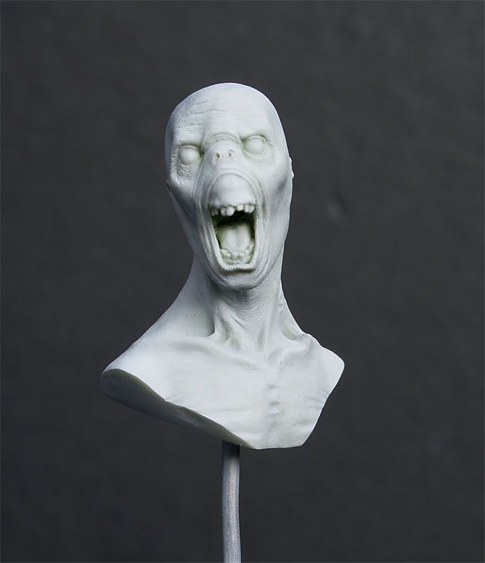
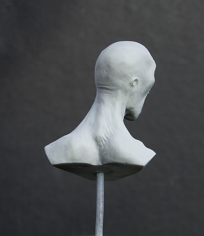
As you can see I was pretty delicate with the dark gray paint, but even now some shades are visible (especially on his cheeks and collarbones).
Colours I used so far:
Base: Mr. Surfacer 1200 (thin layer over a light green resin, so you can still see delicate greenish tint)
Lights: Morrow White - P3
Shadows: Adeptus Battlegrey - Citadel Foundation
2. Acrylic paints
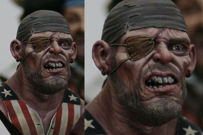
I have no idea why I never thought of painting minis with acrylic paint used by 'mainstream' painters. Probably I just assumed, that they' re not good for miniature painting. But as it turned out, I was wrong. Folks from Knight Models use them and achieve astonishing results. Here you can see few of their works:


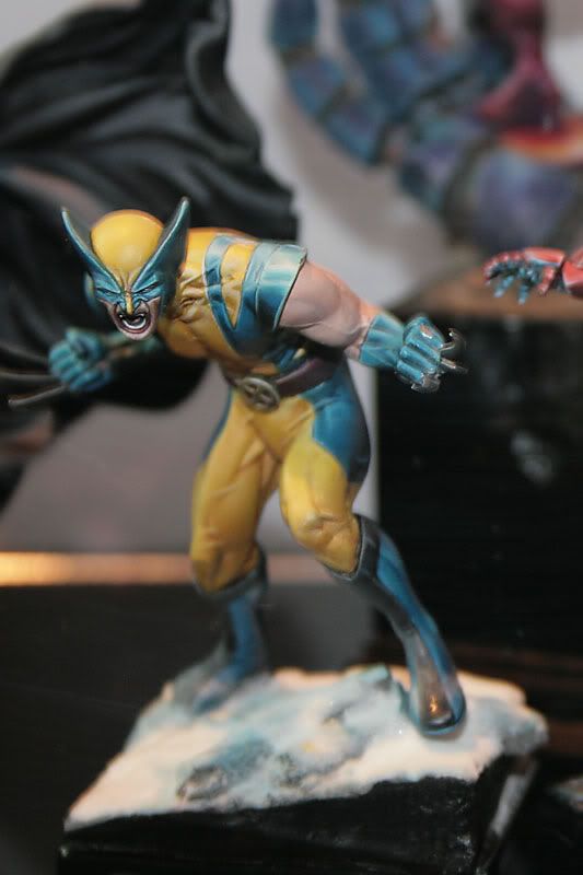
(c) Knight Models
As far I understand those paints have few advantages over acrylics dedicated for miniatures:
- stronger pigment,
- allow to achieve better contrast,
- mat finish
Well in that case I need to give them a try;] I even have one particular set from W&N in my mind:) I'm just not sure how about their durability, but anyway, I paint only display minis, so it shouldn't be a problem for me.
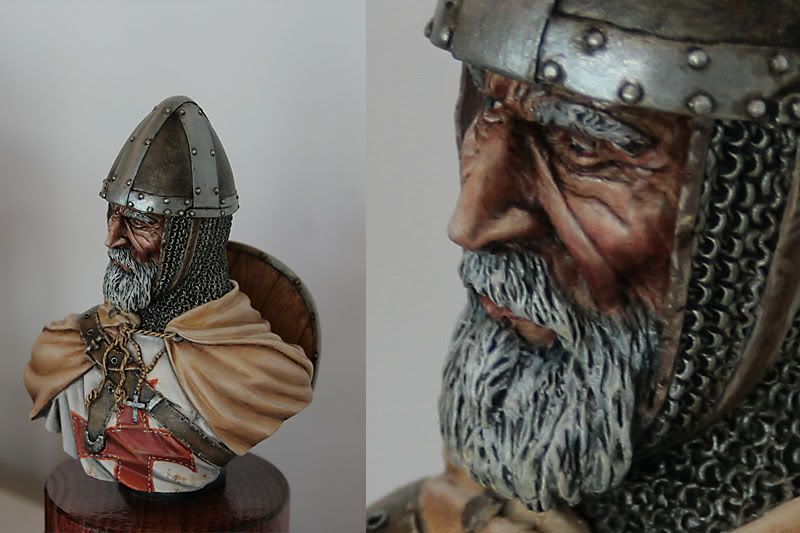
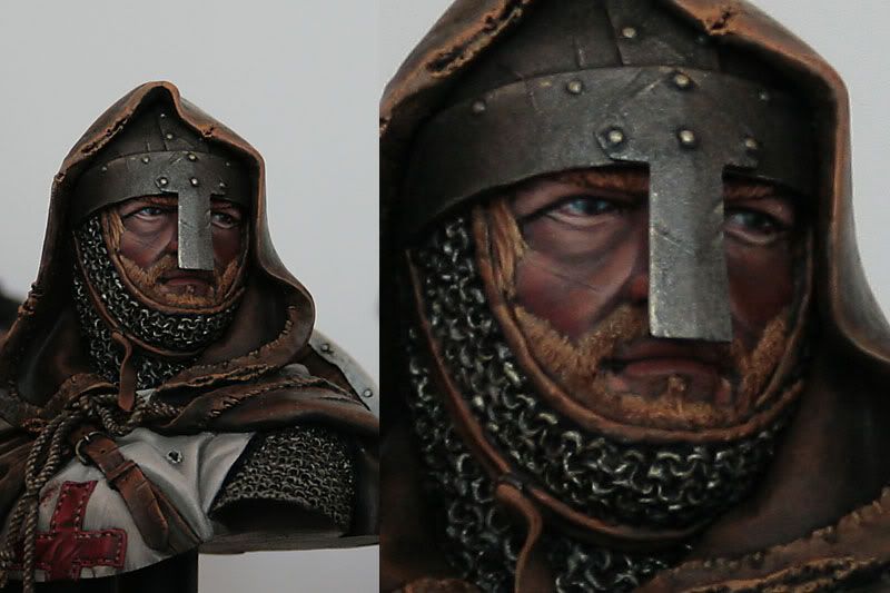
3. Faces.
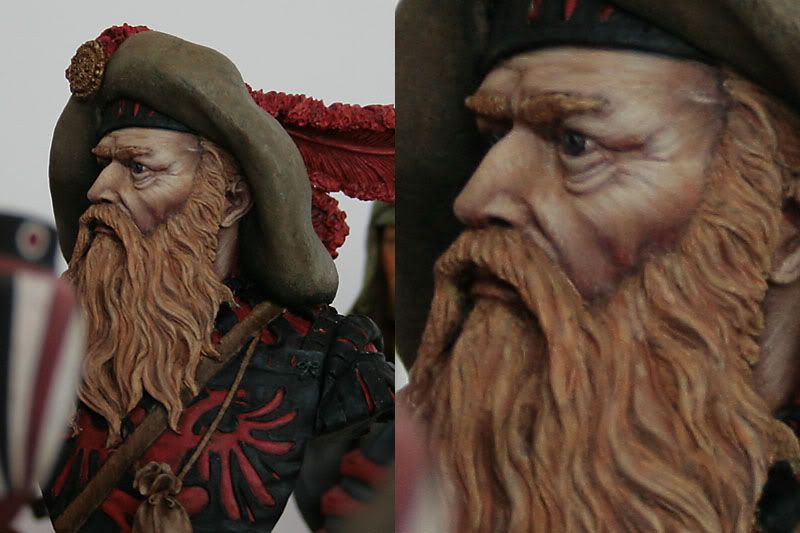
Here are some pictures I took in the competition room. As you can see they're historical pieces, mostly busts. But who said that fantasy painters can't learn from our 'older' friends?
Check out the contrast, the richness of midtones, all the different colours painters used to paint the face... We should definitelly try to achieve similar results. Of course it's impossible to get exactly the same results with 28mm minis, but the general idea is the same: contrast, contrast and contrast once more, with a lot of different colours in between. And when it comes to the larger scale... there is even more room to experiment.


cheers
m
Subscribe to:
Posts (Atom)