Showing posts with label techniques. Show all posts

7 Sept 2014

Wet on wet, for the first time

With Old Gnome waiting for the skin to be finished, I felt I need to 'warm up' a bit on another model. You know, it's always easier to start over again when only the face is painted, not the whole miniature. I decided to go with SK Miniatues piece.


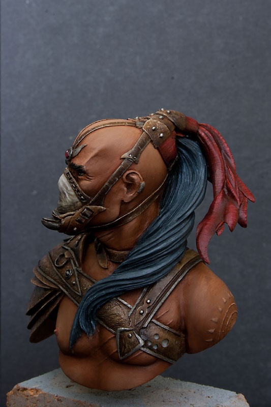
Beautiful Landsknecht bust (scale 1:9), sculpted by Yury Serebryakov. Pretty big face, and the rest looking deceptively simple and fast to paint. And what's more important, I got it p repared already for few months now. At some point I decided to prepare and prime several miniatures and busts. If you're courious about my preping process, I described it in some more details few posts (and almost a year) ago.


And, as you probably can imagine, I got carried away.


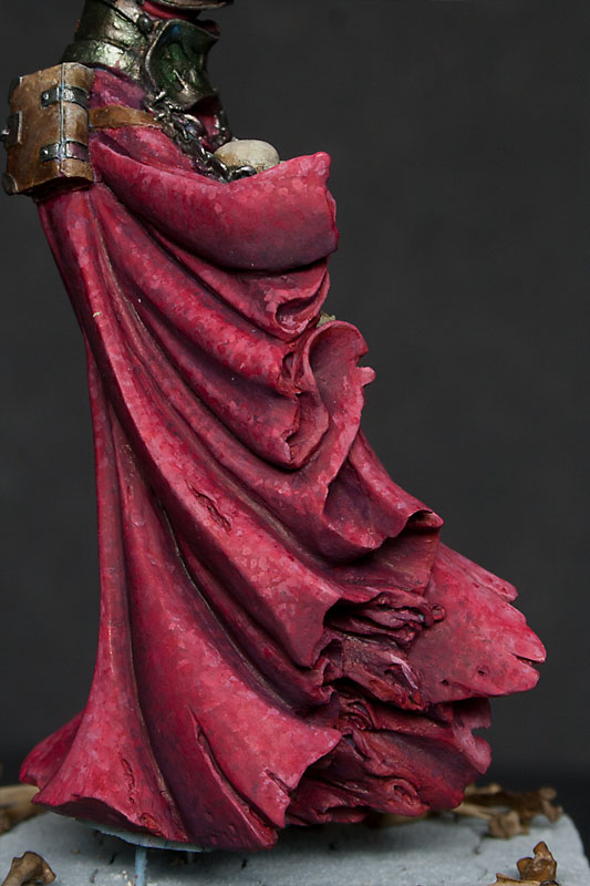
With face basically finished (just few touch ups here and there, when whole thing is done) I just continiued painting. For the first time I managed to successfully use wet on wet technique. Till now I was struggling with big time. I've seen countless video tutorials on this technique (well maybe not countless but a lot for sure), but couldn't get it right. Luckily this time it just worked. I'm especially happy with the red of the tunic and black on the emblem on the front. Both red and black were really difficult for me to paint with high contrast, and this time I quite like the effect. I hope I'll be able to use this technique from now on without any problems. Below you can see a massive close up of the red and black elements. It looks kinda rough here and there, but please bare in mind that the photo is few times bigger than the whole bust, so of course all imperfections are well... bigger.


Right now it's almost finished, just like the Old  Gnome piece... And I can only hope I can finish both of them without further distraction.
The face is somehow desaturated on the photo. I seem to be unable to get the colours right on my new camera, but over all I'm pretty happy with how it turned out. Like I said I'll be doing some more work here, but I'm almost there.
For the rest of the bust I need: repaint the pouch on his chest (draws way too much attention away from the face), fisnish the belt, shirt, beret, golden elements, and of course beard.

cheers
'eM


4 Jun 2013

Anker guy

And here are few solo photos of the 'Anker guy'.
Colours are slightly 'patchy' (to put it mildly) and the skin looks extremely messy, but I'm experimenting with techniques a bit here. Some preshading mixed with building volumes while applying base layer.
Might be a total disaster, but I feel I need to give it at least a try;]


cheers

'eM

24 Mar 2013

Best freehand ever:D


Quick WIP of one of my many many projects... Bloody Yoda from Knight Models.
Quite an early stage, clothes are just mess after trying new technique (not really working thb;/), but the face is almost ready. Of course there is still some work to be done but at least you can see features of his face... And that's all freehand, seriously. At the poto below you can see him just after priming. only the nose and right eye are more or less visible... Left eye is just a blob, mouth... is somewhere under the nose. And tbh that's the face after an exchange;] The first cast it was just one porous blob instead of the face... So I must say, I'm proud of his face now, and of my freehand skills;]


cheers

'eM

16 Mar 2013

Textured material - approach 1

Today I'll try to show you how I painted texture on the red cloth around Grinder's hair, and recreate the same effect on a blue mantle.


First I'll tell you how I achieved this texture on Grinder and them I'll try to do step-by-step on the Wraith and Viking, as the used technique may vary a little.

Red cloth:
At the beginning I was going for plain and smooth red, so I basically did all the lights and shadows as smooth as possible. Then I noticed that it doesn't look good enough, especially next to the leather elements. Besides with this scale it's almost a sin not to try some freehands.
Because I noticed that foldes and recesses of the cloth look almost like feathers, first I was thinking about emphasizing it with adequate freehand, but I was worried that it may look too girly, so finally decided against it. Then I tought about simple fabric pattern. It shouldn't be to difficult to do, and should look real/believable enough.

Because I had only a general idea how to achieve desirable effect I simply jumped into a deep water and took the brush with a bit of 'Jack Bone (P3) and started to paint thin lines on the brightest parts of the cloth.
Why 'Jack Bone? No idea, honestly. I guess it might be simply because it was already on the table and I was to lazy to look for off-white. I trully doubt there was any clear thought behind it.
Of course not every single line was nice and thin, but I decided it's OK. Sometimes manually weaved fabrics have thicker threads as well.

To keep colour nicely red I did some red lines on the bright areas too. It helped to create even more contrast between threads. Then I used the same red to create light threads in the shadows. And finally some Leviathan Purple (GW wash) to create dark threads there as well. After a while I added few beige lines in the shadows at the back of the cloth, in the shadows. And when threads were more or less done, I applied a layer or two of red ink (Deep red W&N). Few more touch ups and little corrections and the cloth was ready.
I think that using wash instead of ink would also do the trick, but probably I'd need few more layers (as inks have more pigment than washes, while still being transparent).

Blue mantle:

For this piece I was planning to do mantle full of mystical symbols and signs.... but I was too affraid that I'll spoil the whole paintjob, so decided to do something simpler. 
The technique used here is pretty much the same as with red cloth on Grinder, first smooth blending, then thin and faint white lines, then some turquoise glazes, turquoise lines and some more glazes. I decided not to introduce really dark lines here, because the whole mantle should stay rather light in colour, ethereal. Also I tried to do the lines thinner than on the Grinder, mostly because the mini is much smaller, and I didn't want the fabric to look fake or extremely thick.

Colours I used to paint the mantle:
- VMC  off-white (70820)
- VMC blue green (70808)
- VMC medium blue (70963)
- VMC black (70950)


At the photos below you can see few steps of the process:


The noticable differences in the hue of the cloak are mostly my experiments with painting, and only a little inconsitency with lighting.

6 Sept 2012

The Grinder - little update

Still lots to do, mostly skin (and eyebrows!!), but I guess I can see the end here;]

Leather elements and that fabric around his hair are finished.
Hair itself and metal elements need some final definition. Other than that, only skin left.
At this point I must say I'm particularly happy with the look of the cloth (some close-ups below). That was the first time I was trying to mimic this kind of texture.
And what do you think? Does it look real or not really?


cheers

'eM

19 Aug 2012

First blood - step by step

I know, I said that Menhom Dark Shadow is finished, and that I'm happy with the way he looks, but with time I came to the conclusion, that I could really pimp him up a bit, especially the sword. So I decided to follow one of Slawol's advices and add some blood (not rust though).
I think that Menhom will be just after a fight, with fresh blood all over him, but not in the place where the fight happened, so I won't have to deal with all the messy splashed and puddles of blood on the ground.

And here's step by step what (and how) I've done.

1. The Blood
To create blood I'm using mixture of Tamiya clear red (X-27), Badab black, Leviathan purple (GW washes) and Smoke (70939 VMC) to get more opaque look. After all blood is not very transparent fluid, even when fresh. Leviathan purple is bringing back some redness to the otherwise brownish mix.

Here you can see few samples I made when I was trying the colours
As you can see on the last picture I added some UHU glue, trying to add more volume and some stickiness. But the result is far from expected. My UHU glue (wich is UHU Power) is not the best one to do the task, it simply didn't mix with the paints properly, instead it's giving me something that looks like bits of solidified  blood and tissue (which BTW reminds me last episode of True Blood I've seen this morning;p). It's not something I can use in this project, as I'm going for fresh blood, but most definitelly something I'm gonna save for future.


2. Hand
Because the way he keeps his right hand reminds me of bird's calves (and because I'm not completely happy with the paint job I've done here), I decided that he's using his hand in the combat, most likely ripping enemies throats and tearing their hearts out, so his hand is covered in blood with possibly some droplets dripping on the ground. In this case I simply covered it with rather thick layer of paint. To do the hanging droplet  I used a hair glued to one of the fingers, with a little tear of paint at the end. Then I covered that with paint to hide the hair. Because I want that to be freshly spilled blood, I used gloss varnish on the top.


3. Sword
First, before I could apply blood on the blade, I had to make metal a bit brighter, so dark blood stand out better. I simply applied few layers of highly dilluted Chainmail (GW), to make sure I won't cover shades completely.
I tried to find some pictures showing how the blood on a sword should be placed to make it reliable. For the sake of realism  I even watched one episode of Spartacus. At some point I was thinking about something like aformentioned Slawol did on one of his Orcs (here), but then I decided against it, as it supposed to be a fresh blood, and 'fresh' in case of blood means runny and without any clots.
But then after all this research and thinking I simply went crazy with gore on the sword and the result you can see on the pictures below. As an excuse I can use that his right hand suggests that lot's of blood spilling was done recently, so sword basically bathed in blood should be justified.


4. Drops and splashes
First of all I did few drops on the ground under the hand, I'd do the same under the sword, but it hangs outside of the base, so it was impossible. I did these drops simply with the brush, because they're not splashes from a hit or something. Then I had to decide what I'm gonna use for more dynamic splashes  on the robe. I know red on red doesn't look too impressive, but that's different shade (temperature) of red, and after all, clean robe would look weird (not to mention a chance to hide a bit this awful head in the middle of his trophy chain). After few tests I decided to use flat and rather stiff brush and a toothpick, and then added few more spots with the brush. Results are on the pictures below.


And here are overall picture before and after:


5.Conclusion
I'm not entirely sure if I made Menhom look better, but at least different;] And I managed to cover with blood few weaker elements, so hopefully changes I made will benefit him.
Besides I learned something new, and that's always a good thing. So I'm happy that I tried new technique, and for the first time it's not looking that bad, right?

And while he's on the table I decided to tweak few more things... but about that tomorrow;]

cheers

'eM


12 Aug 2012

Textures - crushed velvet

This time I'll try to explain how I did the velvet robe on Menhom Dark Shadow.


I started the robe as plain red. As you can see I even added some initial lights and shadows. But then I realised that this robe is big enough (I'd even say huge) to add some freehand, or maybe texture.
Because initially I was going for old and dusty look, the embroidery, I was going to mimic with freehand, would have to be fairly damaged. I wasn't sure  if I'll be able to do that, so I decided to go with crumpled velvet look.

To do that I decided to try 'doting' technique presented by Alexi_Z in her video tutorial. That was my first try, so the results are far from ideal, but I'm quite happy anyway. I learnt a lot doing that piece, and the next attempt should be more successful.

On the first two pictures you can see the initial shading on the robe. It's not perfectly smooth or too contrasty, but it's OK. I'm gonna cover it with lots of dots.


When I made my mind how exactly I I'm gonna paint the robe, I did a little try on one of the creases to find out If I'm capable of pulling that off.


It looked quite nice, so I started to build shadows.
On the pictures below you can see how I was trying to control depth of the shadows not only by used colour, but also by placing more or less dark dots in the recesses.


Then I started to add dots with brighter colours to create lights. Like with painting smooth surface I was building lights gradually, by change of colour and placement of the dots.

Later it was mostly going back and forth with various shades to build a nice gradient. I used quite a lot of base colour to make shadows and lights less uniform. To soften the transitions a bit and made it look more like a fabric, not just collection of dots, I used some red glazes.


On the pictures below you can see the difference glazes did. Colour is more vibrant, and whole robe looks more consistent.


 And here, finished robe, with some final highlights on the edges.


And at the end, colours I used to paint the robe, maybe someone will find it helpful. I know that I'm using some really old and discontinued GW colours, but you can easily find something similar in other ranges.

Base:
Red Gore (GW)

Highlights:
1st light Andrea Flesh Paint Set
Offwhite (70820 VMC)

Shadows:
Liche Purple (GW)
Storm Blue (GW)
Black (70950 VMC)

Washes (GW):
Baal red
Devlan mud
Leviathan purple
Thraka green


cheers

'eM